Merlin’s weekly podcast with Dan Benjamin. We talk about creativity, independence, and making things you love.
Vox Pop: What default settings would you change?
Merlin Mann | Aug 21 2007
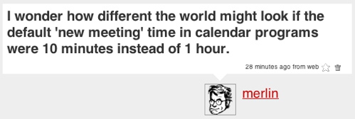
As I am wont to do, I was thinking out loud on Twitter this morning. I'm convinced that, for better or worse, a lot of computer-related habits come straight out of using the default settings. For example a stock Mail.app install checks your email every 5 minutes (I reset mine to 'Manual') and, without interdiction, Apple's mail program will also create all your new messages as "Rich Text" (Nuh uh. Mine? 'Plain Text'). And then, in some cases, even if you want to do things differently, you have to swim upstream to do so. In the case above, I can't set iCal or gCal's default to anything but 1 hour (any more than I can autoset multiple alarms1). God only knows what poor John Gruber would give to have Mail.app more easily let people quit top-posting. The Question to You:What default settings would you love to change in popular applications? Taken a step further, what excellent habits could be taught to users by looking at defaults as something beyond familiarity and day one ease-of-use? Could the aggressive use of smart or personalized defaults create a generation of short-meeting-makers and intersperse-responders? 68 Comments
POSTED IN:
 Gridlines in tables, particularly in...Submitted by Dominic Brown (not verified) on August 21, 2007 - 5:42am.
Gridlines in tables, particularly in MS Word. The default should be none. The point of a table is to make comparisons between entries, typically by reading down columns or across rows. Every line in the way is a barrier to that scanning. A good table designer should evaluate which way the information will be read, and put in only those lines needed to guide the eye in that direction. Ideally, there should be enough space that the arrangement of type and white space suffice, and if not, light-grey background tints for groups of three rows (or columns) work better than lines. Gridliness interfere with type, because they're both made of thin black lines; light grey shading conveys the same grouping of content items, but visually recedes to a more distant plane. The default setting, a full grid and box of same-thickness lines, is exactly dead-wrong; no table should ever have those border settings. I think the default is set that way to solve an unrelated UI issue. If you have the display of table grids set to 'off' in Word, you might insert a new table, and yet see nothing new on screen. The default gridlines-and-box, I suspect, are set to keep this from happening. A better solution would be to turn the grid display 'on' for a few seconds after insertion of the table, then fade it out again. » POSTED IN:
|
|
| EXPLORE 43Folders | THE GOOD STUFF |

