Merlin’s weekly podcast with Dan Benjamin. We talk about creativity, independence, and making things you love.
Vintage logo book scans
Merlin Mann | Mar 18 2008
Vintage Logos - a photoset on Flickr
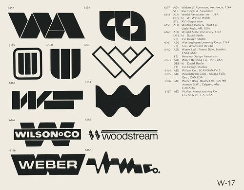
Wow, this is fun for you design and identity nerds -- 120 scanned pages from a book of logos that appears to be from the mid-70s or so (nb: the logos for the U.S. bicentennial and Montreal olympics are included). I'm immediately struck that you could present this many logos in literal black and white; it's amazing how many logos today fall apart if you remove the colors or (God forbid) the gradients. Kinda Related: if you're a logo nerd, monitor (43f site designer) Chris Glass's "design" tag for running coverage and commentary on the (d)evolution of logos over the years. Highlights: "Accepting change," "roundy, 3d, swoosh and twirl," "dog eared," "Another one bites the dust," and "CBS, 2007."
[via: Metafilter] 7 Comments
POSTED IN:
 Re: Vintage logo book scansSubmitted by goodwolve on March 20, 2008 - 7:47am.
As a designer, I create every logo in black and white. If it can't stand up to being in the very raw state of b&w then it can't be used in every application. There is a world outside of the web where logos still need to work. » POSTED IN:
|
|
| EXPLORE 43Folders | THE GOOD STUFF |