43 Folders

43 Folders feed subscription icon - Shiny! Drowning in email? Try Inbox Zero to learn sane tips for dealing with high-volume email. And don’t miss the free Inbox Zero video. »

Login or register

Register for free on 43 Folders to comment on articles, post to our forum, customize your visits, and much more. Current users can login now.

Vintage logo book scans

Vintage Logos - a photoset on Flickr

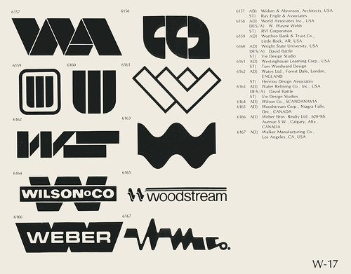
Wow, this is fun for you design and identity nerds — 120 scanned pages from a book of logos that appears to be from the mid-70s or so (nb: the logos for the U.S. bicentennial and Montreal olympics are included).

I’m immediately struck that you could present this many logos in literal black and white; it’s amazing how many logos today fall apart if you remove the colors or (God forbid) the gradients.

Kinda Related: if you’re a logo nerd, monitor (43f site designer) Chris Glass’s “design” tag for running coverage and commentary on the (d)evolution of logos over the years. Highlights: “Accepting change,” “roundy, 3d, swoosh and twirl,” “dog eared,” “Another one bites the dust,” and “CBS, 2007.”

[via: Metafilter]


7 Comments
TOPICS: Design

Comment viewing options

Select your preferred way to display the comments and click "Save settings" to activate your changes.
andre's picture

Download

You can download that book as PDf file from: http://logoblink.com/2008/03/19/world-logotypes-book/

Oliver Ruehl's picture

Re: Vintage logo book scans

This is just perfect timing. I was thinking about a new logo for my site. Very inspiring designs. I also like the total lack of gradients and 3D-ish swooshes!

The link to the PDF is gold too.

I’m a regular visitor and member now and look forward to more sweet posts like this.

Quinto's picture

Re: Vintage logo book scans

I wonder what the designers from the 70s would think if you could have shown them the new Web2.0 logos and color schemes of today.

goodwolve's picture

Re: Vintage logo book scans

As a designer, I create every logo in black and white. If it can’t stand up to being in the very raw state of b&w then it can’t be used in every application. There is a world outside of the web where logos still need to work.

Fontmedia's picture

Vintage Book Scans

Totally agree with goodwolve. I have always taught and been taught to design it in black first; then add color, if you need to.

Besides, companies still fax and copy stuff, and if the logo is too delicate with the color, part of it can just magically disappear. Clients usually don’t like that.

Trevor J's picture

Neato

Hey, that’s really very cool. Like it!

-Trevor Borderlinetheory.com

Mashedspud's picture

A lot of scope here

Any logo nerd with time on their hands could have a ball modernizing those logos. Digitize them, at a bit of color, flashy visual effects and “Voila” a successful logo makeover.

Mashedspud Green lasers rulz

 
EXPLORE 43Folders THE GOOD STUFF

An Oblique Strategy:
Discard an axiom


STAY IN THE LOOP:

Subscribe with Google Reader

Subscribe on Netvibes

Add to Technorati Favorites

Subscribe on Pageflakes

Add RSS feed

The Podcast Feed

Inbox Zero

The original 43 Folders series looking at the skills, tools, and attitude needed to empty your email inbox — and then keep it that way. Don’t miss the free video of Merlin’s Inbox Zero presentation.

Get Started with ‘GTD’

David Allen’s popular productivity book and the system on which it’s based help turn ‘stuff’ into actions that support valuable outcomes.