Merlin’s weekly podcast with Dan Benjamin. We talk about creativity, independence, and making things you love.
Vintage logo book scans
Merlin Mann | Mar 18 2008
Vintage Logos - a photoset on Flickr
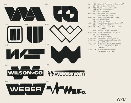
Wow, this is fun for you design and identity nerds -- 120 scanned pages from a book of logos that appears to be from the mid-70s or so (nb: the logos for the U.S. bicentennial and Montreal olympics are included). I'm immediately struck that you could present this many logos in literal black and white; it's amazing how many logos today fall apart if you remove the colors or (God forbid) the gradients. Kinda Related: if you're a logo nerd, monitor (43f site designer) Chris Glass's "design" tag for running coverage and commentary on the (d)evolution of logos over the years. Highlights: "Accepting change," "roundy, 3d, swoosh and twirl," "dog eared," "Another one bites the dust," and "CBS, 2007."
[via: Metafilter] 7 Comments
POSTED IN:
 Vintage Book ScansSubmitted by Fontmedia on March 24, 2008 - 9:56pm.
Totally agree with goodwolve. I have always taught and been taught to design it in black first; then add color, if you need to. Besides, companies still fax and copy stuff, and if the logo is too delicate with the color, part of it can just magically disappear. Clients usually don't like that. » POSTED IN:
|
|
| EXPLORE 43Folders | THE GOOD STUFF |